Every month, we publish what's new in Lugor, and all our customers get it as soon as the release goes live.
September was devoted to page composition. Your most ambitious mockups can now be rebuilt block by block, and your brand guidelines now govern far more details, from typography to gradients. Enjoy the read!
1. Build your Heroes and Banners from free-form blocks
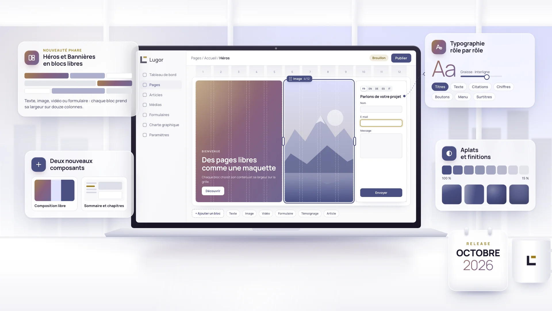
The Hero and the Banner are no longer limited to two zones, with text on one side and an image on the other. They hold as many blocks as you like, which you reorder by drag and drop. Each block chooses what it contains (text, image, video, form, testimonial, article or list of selling points) and its width on the twelve-column grid.
Your existing Heroes and Banners are converted automatically on update, with the same look.
The Hero gains a Full screen height that fills the visitor's entire screen, phone address bar included. On a phone, when the content exceeds the chosen height, margins and text size tighten without ever cutting off the content.
A block can also extend into the margins to reach the edge of the component, and each element added to a block can fill it completely, without distortion. An empty block now reserves a precise height: it's the missing tool for reproducing a mockup down to the pixel.
2. Two new components to build your pages like a mockup
Free Content Layout places several blocks side by side on the twelve-column grid, under a single background and a single title. Each block carries its own text, image or form, and can take its own brand color. Two columns of text side by side no longer take two components.
The Table of Contents and Chapters component shows a table of contents that stays on screen while readers scroll, next to chapters filled with free-form blocks. You set the spacing between blocks, the divider lines between chapters and the styling of each one. A chapter block can also become fully clickable.
These components share a Mosaic checkbox: when checked, your colored blocks touch each other and reach the edge of the component, like the editorial grids of major websites. Four block widths are added, from one twelfth to eleven twelfths, and each width now displays its value in twelfths. A width of 0% finally places a vertical line between two blocks without shifting the layout.
Your selling points and logo walls now share a single model, Showcase. Columns, sizes and alignment are set on the model, where you insert it, or element by element.
3. Typography you can set role by role
The Typography tab of your brand guidelines offers an advanced configuration. Seven roles are set separately: headings, body text, quotes, figures, buttons, menu and eyebrows. For each one, you choose the font, weight, line height, letter spacing, capitals or italics, with a live preview next to every setting.
Only the weights actually available in the chosen font are offered. Beyond two fonts, a warning tells you the loading cost for your visitors. A button resets the style settings to their starting values without touching your fonts.
The admin text editor now displays your content in your site's typography: as you write, you see what your visitor will see. Its heading sizes follow those of the site, and a new Extra large size joins the menu.
4. Your brand guidelines control even more details
The gradient in your brand guidelines is adjustable: you choose its angle and the position of each of its three colors. Each brand color also plays a specific role. The accent color tints active elements, such as the current menu item or the selected form field.
Solid color fills gain eight intensities, from 100% to 15%, and four finishes that avoid a flat, painted-on look: fine lacquer, grazing light, sculpted and velvety. The page background and the section background join the available fills, so a block can return to the site background next to a painted neighbor.
Your header takes a color from your brand guidelines, like your components. The eyebrow can take CSS written by your team, a signature shape for example, with no risk of spilling over onto the rest of the page. This setting is reserved for administrators.
5. Refreshed visual styles
The visual styles catalog has been completely reworked. It now has twelve styles, including two new ones, Mist and Bichrome, and five styles rebuilt on a new material: Porcelain, Pearl, Lacquer, Frosted Glass and Blotch Gradient. All share the same shadow and relief rules, for more consistent pages whatever your brand guidelines.
Buttons adapt to the surface they sit on. On a painted background, each button style keeps its look and takes a shade of your brand color calculated to stay readable.
Eight older styles leave the catalog. Blocks that used them switch to the Neutral style: we recommend choosing one of the new styles for them.
6. Forms translated from end to end
On a multilingual site, each form now speaks its visitor's language. The success message and the button that follows the confirmation are entered language by language. The redirect after submission leads to the translated page.
Notification emails are sent in the language of the page where the form was filled in, and that language appears in the submissions list. Error messages are translated into the five content languages.
7. Faster, safer, better for SEO
Your pages send less JavaScript to your visitors. The heaviest components, such as the bento grid, testimonials or video, now load only when the page needs them. Code for legacy browsers has been removed, and your forms arrive in the page from its first render.
Your users' passwords are now protected by a hash that is 24 times more costly to attack, in line with the leading public recommendation, without anyone having to change theirs. An access key for an AI assistant is now shown only when it is created: remember to save it at that moment.
Your sitemap now declares each page's images to search engines, and your robots.txt file recognizes forty bots by name, including those of AI answer engines.
In conclusion
With the October release, an ambitious mockup can be rebuilt in Lugor block by block, on the twelve-column grid, with no development. Your brand guidelines now control typography role by role, the gradient and color finishes, and your forms speak each visitor's language. Everything is active as soon as your site is updated.
Related articles
 Release notes
What's new in Lugor: September 2026
On the menu for this release: better ergonomics and simpler, unified use, to keep pushing further toward one of the most polished no-code building platforms on the market.
 Release notes
What's new in Lugor: August 2026
Lugor's August 2026 updates: richer Hero block, page composition in sections and columns, new Testimonials block, more flexible modals and media.
 Release notes
What's new in Lugor: July 2026
Four new components, a faster and safer core platform, and a platform built to be driven by an AI assistant. A tour of what shipped in July.
More value. Less code.
Lugor, the turnkey web platform.